
Designing a Bilingual Gujarati–English Brochure: Layout, Fonts and Print Checks
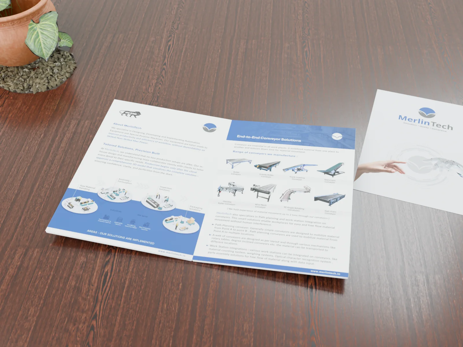
Many Gujarat businesses sell to two audiences at once: buyers and dealers who read English, and customers, farmers, contractors or shop owners who are far more comfortable in Gujarati. A bilingual brochure lets one printed piece work for both. It also introduces problems that an English-only brochure never has: a script that needs more vertical space, translated text that is longer than the original, fonts that silently break, and proofreading that only a fluent reader can do.
This guide walks through the decisions that matter, in the order you will meet them, so the final print run reads correctly in both languages.
Start with how the brochure will be used
Before choosing a layout, answer three questions. Who picks the brochure up, and which language do they read first? Will it be handed over in person, mailed, or mostly shared as a PDF on WhatsApp? And does every page need both languages, or only the pages a Gujarati reader actually uses, such as the product range, the benefits and the contact details?
The answers decide how much space each language gets. A dealer handout for a pump or pipe range might keep detailed specification tables in English (the numbers are the same in both languages) and put the explanation, benefits and warranty terms in both. A brochure for a hospital, school or retail customer usually needs full parity.
Four layout options, and when each works
- Side-by-side columns. English and Gujarati on the same spread, one column each. Easy to compare, good for short text and product pages. It halves the width available to each language, so it struggles with long paragraphs.
- Stacked blocks. Each section appears in English, then in Gujarati, under the same heading or image. Works well for single-sheet leaflets and flyers.
- Facing pages. Left page English, right page Gujarati, with the same images and structure. Clean and calm, and each language reads as a complete page. It needs more pages, so it costs more to print.
- Two separate editions. One design system, two files. This is often the best choice when the brochure is mainly shared digitally, because each reader gets a shorter file entirely in their language.
Whichever option you pick, keep images, icons and diagrams shared between the languages. That keeps the brochure consistent and makes the second language cheaper to produce.
Plan for text expansion before the design is approved
Translated text is rarely the same length as the original. Gujarati versions of marketing and technical copy often run noticeably longer than the English, and the script itself needs extra line height, so the same paragraph can take up much more space on the page. A practical rule is to leave around 20 to 30 percent spare room in the Gujarati areas of the first layout, then adjust once the real translation arrives.
The worst outcome is approving an English layout that is already full, then forcing the Gujarati into it by shrinking the type. Small Gujarati text is much harder to read than small English text, because the vowel signs above and below each letter lose their detail first.
Choose Unicode fonts, not legacy ones
Many printers and older desktop files in Gujarat still use legacy Gujarati fonts that map Gujarati shapes onto English keyboard characters. They can look fine on screen, but the text is not real Gujarati: it cannot be searched, copied into WhatsApp, read by a screen reader or reused on a website. When the file moves to another computer without that exact font, the text turns into random Latin letters.
Use Unicode fonts instead. Good, freely licensed options include:
- Noto Sans Gujarati and Noto Serif Gujarati: designed to sit alongside the Noto Latin families, so English and Gujarati match in weight and size.
- Hind Vadodara: a clean sans serif with both Gujarati and Latin, suitable for body text and tables.
- Mukta Vaani: a friendly sans serif with many weights, useful when you need a clear hierarchy of headings.
- Baloo Bhai 2: rounded and informal, better for headings in consumer-facing material than for long technical text.
Pick a Gujarati font that comes with a matching Latin design, or pair one with a Latin family of similar proportions. Then set them so they look the same size on the page. The Gujarati often needs to be set one or two points larger than the English to appear equal.
Typography settings that keep Gujarati readable
- Line height: allow more leading for Gujarati than for English, roughly 1.5 to 1.7 times the font size for body text, so vowel signs and conjuncts do not collide between lines.
- Minimum size: keep printed Gujarati body text at about 10 pt or larger, and test the smallest text by printing it at actual size.
- No fake bold or italic: use the real bold weight of the font. Gujarati has no true italic, so do not slant it to match an English italic.
- Numerals: decide whether prices, phone numbers and model numbers use Gujarati digits or Western digits, and use the choice consistently. Most businesses keep phone numbers and model codes in Western digits in both languages.
- Hyphenation: switch off automatic hyphenation for Gujarati unless your software handles it properly. A badly broken word is worse than a slightly uneven line.
Use software that shapes Gujarati correctly
Gujarati letters combine into conjuncts and take vowel signs that must be positioned by the font and the layout software together. If the software does not support complex scripts, the text can look correct letter by letter but be wrongly joined. In Adobe InDesign, for example, Gujarati paragraphs need the World-Ready Paragraph Composer rather than the default composer. Always check a few conjunct-heavy words in the final layout against the translator’s original file.
Proofreading: the step that cannot be skipped
A designer who does not read Gujarati fluently cannot proofread it. Build two proof rounds into the schedule: one by the translator after layout, because line breaks and text flow can change meaning or drop words, and one by someone at your business who knows the products and the customers. Ask them to read the brochure as a customer would, not to compare it word by word with the English.
Print checks before you send the file
- Export a print PDF in CMYK with 3 mm bleed on every side and crop marks, unless your printer asks for something different.
- Embed all fonts in the PDF, and open it on a second computer to confirm the Gujarati still renders.
- Keep important text at least 5 mm inside the trim edge.
- Use images at around 300 ppi at their printed size.
- Ask the printer for a hard-copy proof or a digital proof of the first run, and check the Gujarati on paper at actual size.
Do not forget the WhatsApp version
Most brochures in Gujarat are shared far more often as a PDF than they are printed. Export a separate digital version in RGB, with live links on phone numbers, email and the website, and keep the file small enough to send quickly over mobile data. If you produced two editions, name the files clearly in each language so the right one is forwarded.
How we approach bilingual brochures
When we design a multilingual brochure, we lay out the base language first and send it for review before translation, leave room for the second language from the start, and re-check every page after the translated text is placed. You receive print-ready files, a lightweight digital version and the editable source file. You can see a printed company brochure we designed in our portfolio. If you need a longer product reference document rather than a brochure, our product catalogue design service is built for that.
Every project is quoted individually. See how we quote, or tell us about your brochure and we will send a free written quote within 24 hours.
Frequently asked questions
Should a bilingual brochure use one file or two?
If the brochure is mostly printed and handed over, one bilingual file works well. If it is mostly shared on WhatsApp or by email, two separate editions are usually better, because each reader gets a shorter file in their own language.
Which font should I use for Gujarati in print?
Use a Unicode font such as Noto Sans Gujarati, Noto Serif Gujarati, Hind Vadodara or Mukta Vaani, ideally one with a matching Latin design. Avoid legacy non-Unicode fonts, because the text breaks when the file is opened elsewhere and cannot be reused online.
Why does my Gujarati text look broken in the PDF?
Usually the font was not embedded, a legacy font was used, or the layout software was not set up for complex scripts. Embed fonts on export and use a composer that supports Indic scripts, such as the World-Ready Paragraph Composer in InDesign.
Can you add Hindi as well as Gujarati?
Yes. Hindi uses the Devanagari script and needs the same care with fonts, spacing and proofreading. Adding a third language works best as separate editions that share one design system.


0 comments
No comments yet. You can start the conversation.